Shades of white
We were asked by our client to help find the perfect white for her house. There would be no other paint finish, so we had to get it right. From her proposition, we knew white could never be…just white. Our challenge became an exercise in deepening knowledge and awareness. Importantly, our search wouldn’t simply travel through white but through colour. It would also involve the material qualities of the paint, all seen in the context of our surroundings. Options quickly grew.
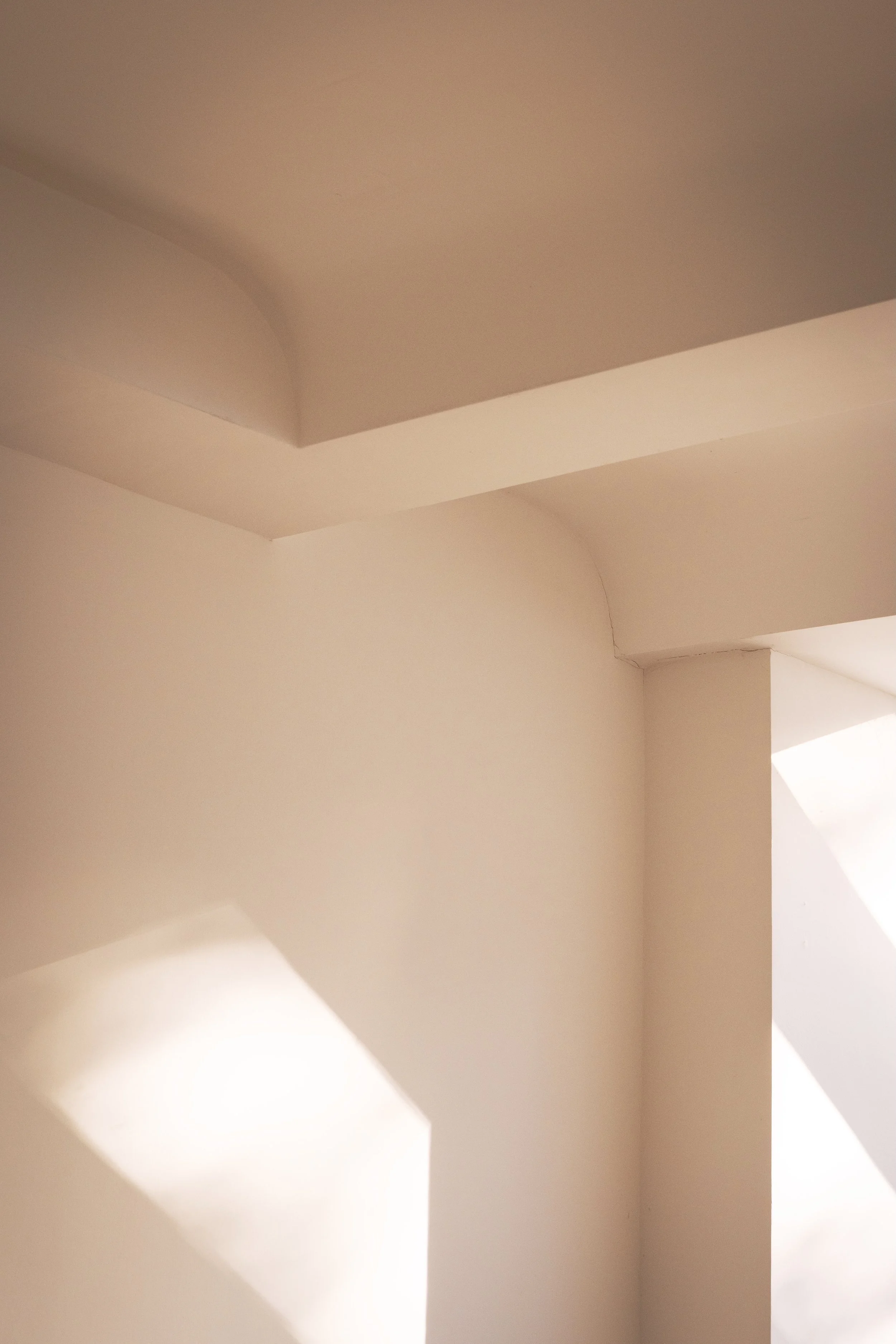
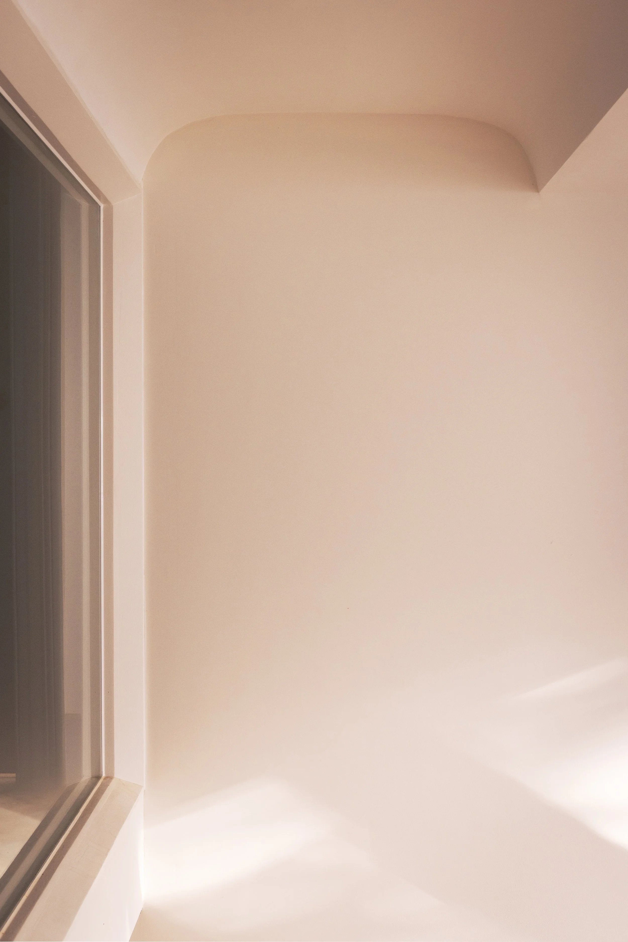
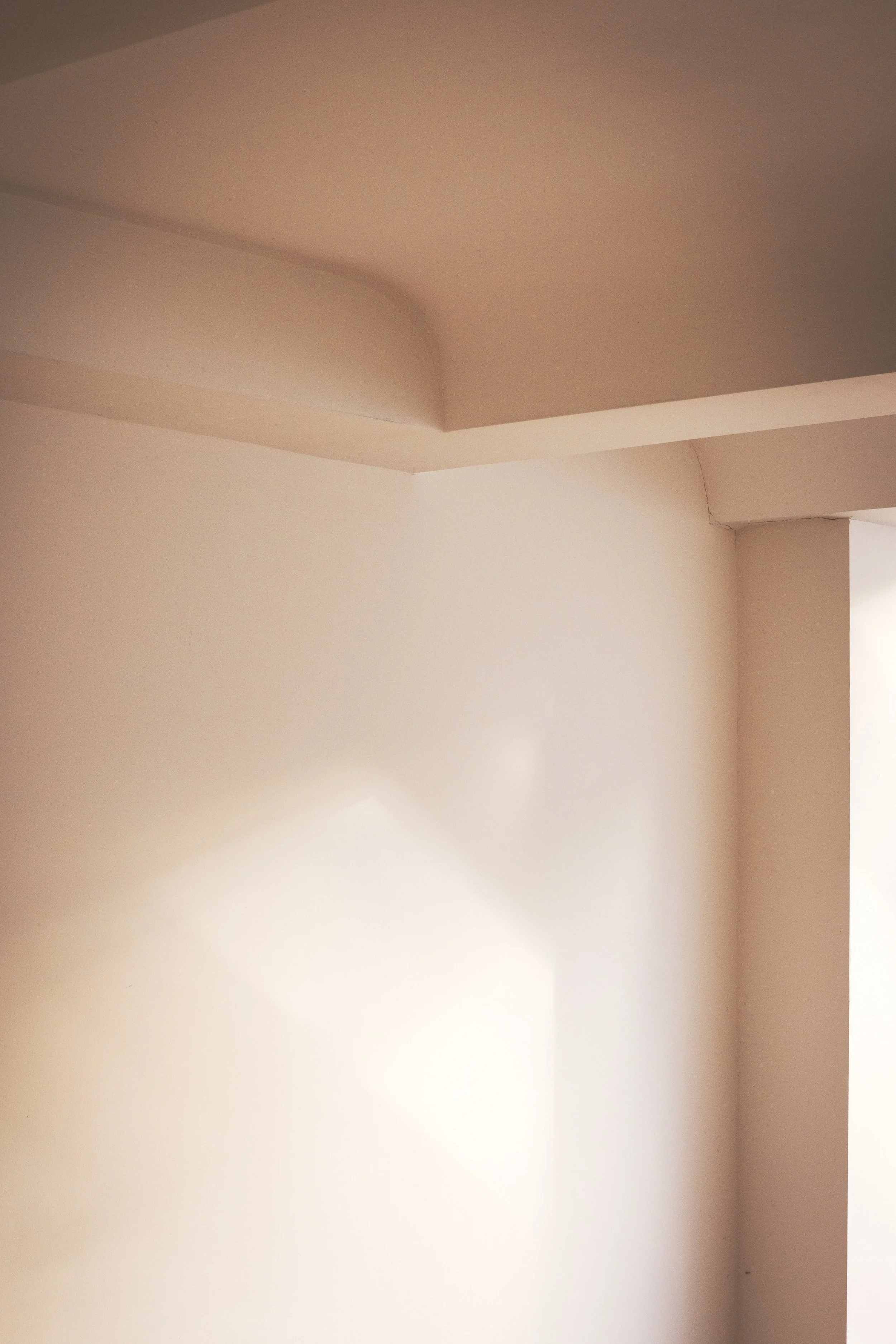
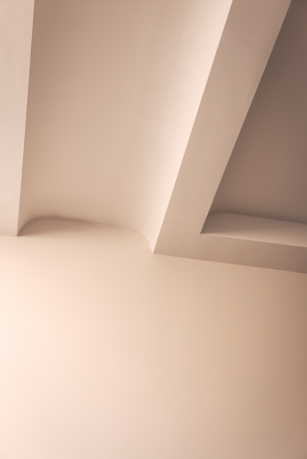
There were those with more yellow to green, blue, red, purple and everything between. Some looked thick, others thin and transparent, more matt and more sheen. All changing over the course of the day and on different faces of the room. There were times we felt we were no longer looking at white.
Coming back into the room another day revealed further change. What we remembered was not the same as what we would see the following day.
Suggestive names tagged only gave a flavour of what to expect: Swiss Coffee, White Dove, White Cotton, Wimbourne, All White, White Tie, Shirting, Slaked Lime, Clean White, White 01, 02, 03, Pearl.
The only way to know was to test — one sample next to another — in a big room and small, windows facing South, North or from a skylight above. Several patches of the same in corners, on the ceiling, next to the window and under. Working collaboratively, some were dropped right away while others held on for a while longer. As many options were lost, more were found. The task became more complicated as we progressed. The sea of paint cans continued to grow like a crowd in a room. All shades of white.
At the time, I recalled the Bauhaus founding architect, Walter Gropius, and the house he built for himself in Lincoln, Massachusetts, USA in 1938. While opposite to what we were looking for, would this give us some insight? For his central hallway, he set the task of making the room a perfect white cube of space with all surfaces appearing the same — knowing that the only way to do this was to make each surface different. Within sun and shade are different colours — from warm yellow to cool blue. The exercise was a masterclass in perception typical of the Bauhaus. Invisibly, each face subtly different. I walked up close, my hands cupped to block the daylight to find under the window, yellow. Always in the coolness of shade it needed to be warmed. On the opposite side of the window, awash in direct daylight, needed to be cooled. This was with a blue. At the corners, places of transition, more complicated changes were being made. To understand the spectrum of light and colour was essential. Offsetting and working with the effect of the sun and orientation, across the sky, season to season, surfaces on the North side, South, East and West plus the ceiling above. Whites from warm to cool; from an evaporating pink to a pale blue or blush of orange formed a balanced, undifferentiated white — simplicity through complexity.
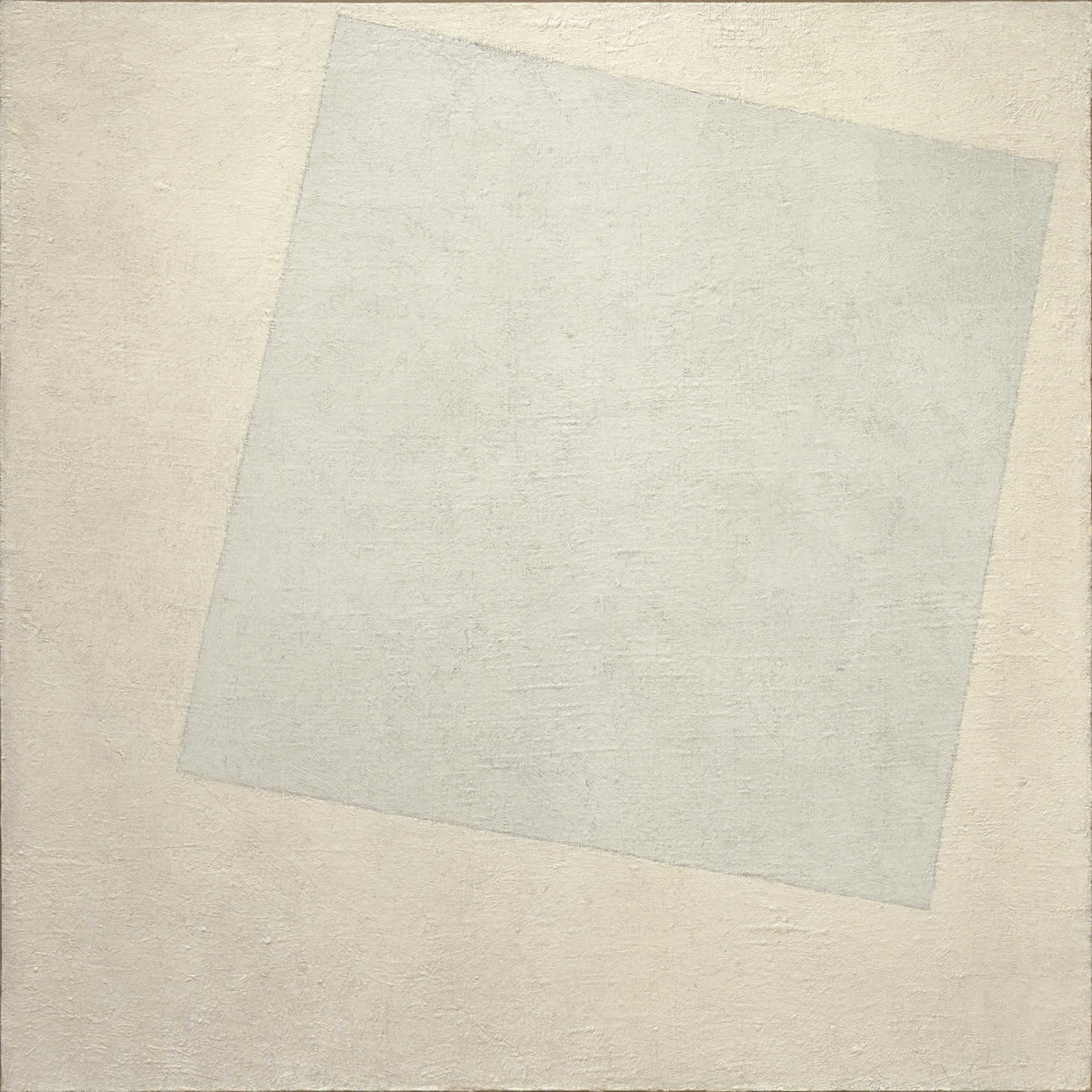
Image of Kazimir Malevich, “White on White”, 1918.
Immersed in this all, not yet with a satisfactory choice, we turned to a colourist, who helped us to understand colour more, exploring alternatives by putting blues, reds, greens and yellows behind our whites. The options were multiplied and made more daunting and complicated. Even more cans of paint with permutations climbing into the thousands. While fascinating… for the sake of time, we had to abandon that line of research.
After all our efforts, a dramatic and defining moment arose. It was sudden. As we presented our recent findings, our client paused and pointed at a wall of white. She said, “What white is that one there?” Not yet labelled, we called the painter over and asked. He looked at us with a curious expression and paused, “That’s not a colour. It’s just the undercoat.” Our client responded, “What? Oh my, after all that… I think this is the one!” We agreed. Of course. We all laughed… having gone around the block so many times, we ended a complicated process with the simplest solution.
It was the chalkiness and softness of the colour that drew everyone, capturing the light in a way that picked up what was around it — a canvas that changed through the richness and change of its context. As is often the case, seemingly difficult questions have simple answers, but you have to go through a process to find them. Colour and richness would rely on the furniture, flooring and changing shape of the room across the day. Job done.